ABOUT
Media Credit: Ipsos
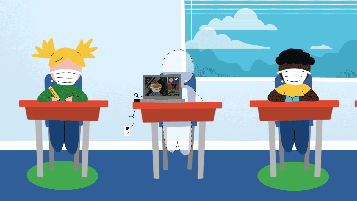
The Three Levels of DH in Our Project
Selecting the Sources
Since our project focuses on how the COVID-19 pandemic impacted the U.S. education system and student outcomes, we selected peer-reviewed sources such as academic journals and articles to provide historical context and evidence that would further support our findings to the research questions. We examined disparities in educational performance across different states and demographic groups, particularly in California and Ohio because of their differing approaches to COVID-19 pandemic and education. Fortunately, many researchers were interested in how COVID-19 impacted various topics, including education. We used key terms such as “Covid-19,” “learning loss,” and “disparities,” and we were able to find numerous articles. Our sources include historical data on disparities in education, the effects of remote learning on students’ mental health, and educational reforms that could be considered to close the achievement gaps. For example, one of the sources found that achievement gaps among students from low-income families barely decreased post-pandemic (Bailey, et al., 2021). Another source argued that students’ perceptions with online education effectiveness in Romania were influenced by their access to technology and familiarity with online communication (Butnaru, et al., 2021). All of this provided us with the various perspectives we needed to form a better understanding of how the pandemic impacted education across states and students and educator sentiment across different demographics. More information about the sources we used can be found in our annotated bibliography.
Processing the Data
To explore how the COVID-19 pandemic impacted the educational system in the US, we used the SEDA 2023 data. This data comes from the Educational Opportunity Project at Stanford University, a national database that contains rich data for insight into academic performance. The dataset includes aggregated test scores (math and English language arts) across various school districts in the US for the years 2016, 2017, 2018, 2019, 2022, and 2023. It also includes information on student subgroups such as race/ethnicity and socioeconomic status. To provide a broader context for academic and socioeconomic trends during the COVID-19 pandemic, we supplemented with data from other years, notably from 2020-2022 in order to track shifts over time.
Before processing our data, we made sure to understand what each variable in the dataset represents by carefully reading the SEDA 2023 Technical Documentation PDF. The documentation also informed us on where the data came from and how they collected it. Since our project is focused on comparing the pre-pandemic academic performance with post-pandemic academic performance in two states, California and Ohio, we added a filter and reduced our dataset to only include the data of these two states.
However, we identified gaps in our coverage of the data, where test scores, enrollment numbers, and assessment results were missing across multiple school districts. Our dataset would have been more informative if it had consistent records for all years, particularly in the post-pandemic context. Although the dataset is lacking in some areas, we decided to center our research on comparing pre-pandemic and post-pandemic educational outcome trends in California and Ohio, which enabled us to create clearer data visualizations and conduct a more focused analysis of the data available to us.
To create our data visualizations, we decided to use Tableau, R, and Python. Due to our familiarity with different languages, we were able to leverage our various skill sets in each language to develop insights. We made sure to understand the codebook, analyze the types of scores present, and distribution of values collected in SEDA 2023 for a holistic view of the data. We then embedded our data visualizations into our website and made it interactive. As a result, we were able to provide a multifaceted and complete picture about educational outcomes from the COVID-19 pandemic through our data and visualizations.
Presenting Our Narrative
To create our website, our team utilized a HumSpace domain provided by UCLA and designed the site using WordPress. We chose WordPress because of its wide range of themes and the ability for users to collaborate efficiently. During our lab discussions, we brainstormed design choices and selected a high-contrast theme to enhance accessibility, ensure easy navigation, and provide a visually pleasing experience. Due to WordPress’s open and public nature, our work can reach a broader audience and encourage engagement.
After establishing the website’s structure, we outlined the content for each page and determined the most effective layout and organization. Then, our group delegated each section for the members of our project to complete. Our group’s contributions are outlined in our chosen roles. After each member completed their respective sections, we collaborated to refine the content and ensure a comprehensive, yet concise narrative. Additionally, WordPress’s design flexibility allowed us to integrate structured sections and interactive data visualizations, which helped us present our findings in a compelling way and craft a cohesive narrative for our users.
Meet the Equity Explorers! ✏️🚀
Lucy Yin

Project Manager
Year: Class of 2025
Major: Computational and Systems Biology
Hometown: Bay Area
About: As the Project Manager, I was in charge of making sure our team was effectively completing tasks to build towards the completion of our website.
Melissa Chang

Data Visualization Specialist
Year: Class of 2026
Major: Data Theory
Hometown: Tokyo, Japan
About: As a data visualization specialist, my role was to oversee the charts and graphs we decided to include in our project by navigating different data visualization platforms. I made sure our visualizations were clear and established arguments for our research question.
Zeckeria Kamrany

Web Manager
Year: Class of 2025
Major: Computer Science
Hometown: Laguna Hills, CA
About: As the web manager, my role was to oversee the changes and implementation of the website. I worked toward developing an organized website with easy-to-navigate UI.
William Udo

Content Developer
Year: Class of 2026
Major: Applied Linguistics with a specialization in Computing and a minor in Digital Humanities
Hometown: Inglewood, CA
About: I oversee the site’s core narrative, integrate data visualizations into our material, and collaborate with all team members to make sure our project is completed properly.
Tiffany Pham

Editor
Year: Class of 2027
Major: Cognitive Science
Hometown: Garden Grove, CA
About: As the editor, I was in charge of keeping a cohesive narrative across our project, as well as editing our visual and written content. I made sure our work tells a story and present our findings in a clear, logical flow. I also helped design the website!
Boqian Mao

Data Specialist
Year: Class of 2025
Major: Statistics & Data Science
Hometown: Henan, China
About: As a data specialist, I was responsible for the cleaning and arranging the dataset of our project. I made sure the final dataset is easy to work on and well-organized for our data visualization part.
Acknowledgements 🌱
Julia Stoddard, for her continuous guidance and kindness throughout the development of our project. Thank you for being our TA and all your guidance to help us move forward in our final product!
Dr. Nicholas Sabo, for imparting valuable knowledge about the realm of digital humanities to us. We learned so much and appreciate you widening our perspective in viewing and interpreting sources through the lens of technology.